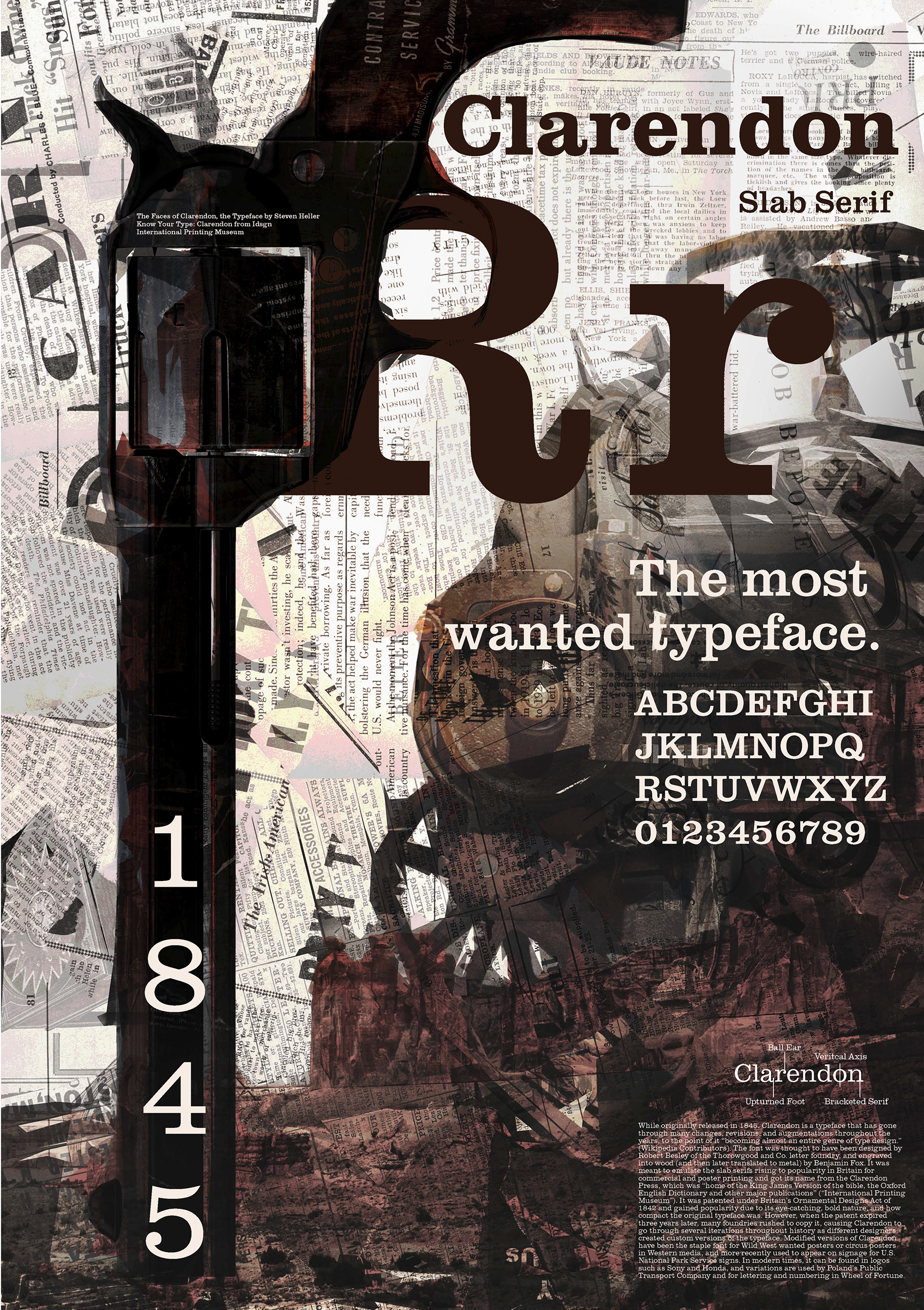

In this project, the letterforms themselves serve as both content and form. We were each assigned an influential historic typeface and were asked to create type specimen posters celebrating the typeface’s visual and tonal characteristics. We began to address creating cohesive layouts with many different elements and the role of scale. The first step was to typeset a paragraph describing the typeface’s origins, identity, purpose, design method, and contemporary usage. This paragraph also helped to determine the scale of the small text. The next step involved quick iterative thumbnail sketches in which the organizing principle of the poster was a hero letterform, the alphabet, or a concept alluding to the face’s contemporary or historical usage. The completed poster includes the typeface name, category, classification, full alphabet, distinguishing characteristics gridlines diagram, a hero letter with annotated details, a descriptive paragraph, and a relevant quote.
MECA&D, Fall 2023, Typography I
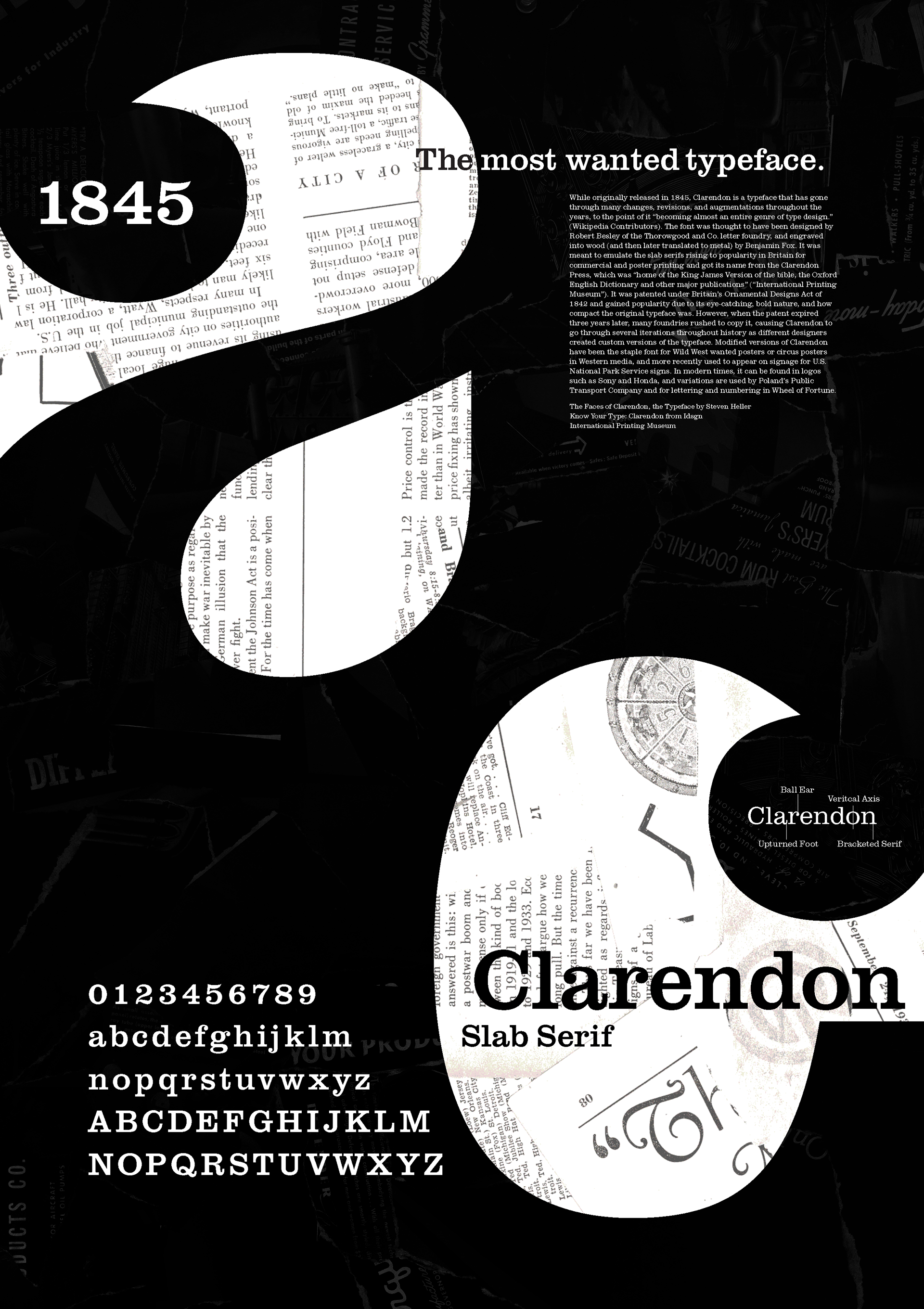
An additional type specimen poster that was not submitted as a final but rather an alternate exploration of the Clarendon font.